- Featured
- Export Emails to Sheets
- Screenshot Tool
- Email Tracker
- MailKing - automated mass emailing
- Save Emails as PDF
- Export Emails to Google Docs
- Multi Email Forward
- Meeting Scheduler
- Email Templates
- All Apps
- Gmail Label Sharing
- Auto Bcc for Gmail
- Mobile Text Alerts for Gmail
- Save Emails to Google Drive
- Save Emails to Dropbox
- Auto Follow Up for Gmail
- Backup and Archive Emails to Amazon S3
- Free Video Email
- Gmail Web Clipper
- Send your Email to SMS
- Gmail Snippets
- Gmail Phone
- Email Zoom Text Reader
- Gmail Screencast
- HTML Editor for Gmail
- Notes for Gmail
- Rename Email Subject
- Gmail Free Online Polls & Surveys
- Schedule Emails
- Snooze Emails
- Share Emails as Links
- Gmail URL Link Preview
- Gmail Time Tracker
- Free Email Tracking Blocker
- Save and Backup My Emails
- Attach And Share Cloud Files for Gmail

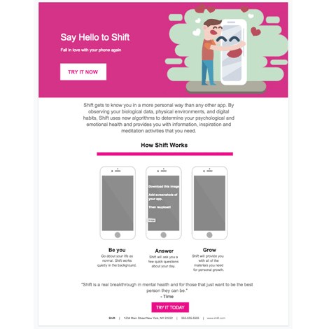
Introducing the "New App" Google Docs template – a fresh, vibrant, and engaging design crafted for app developers and marketers to showcase their latest mobile applications. At the very top, the template captivates its viewers with a bold, bright pink header that instantly grabs attention. Complementing this pop of color is a whimsical illustration of a person warmly embracing their phone; both are beaming with joy, embodying the connection users can feel with a great app. As you move further down, the template effortlessly transitions to a space dedicated to exhibit the unique features of the user's application. Every aspect of the design aims to narrate the app's story, its benefits, and its value proposition. Culminating the template is a compelling call-to-action button, inviting viewers to download the app and experience its wonders firsthand.

Why choose the "New App" template? In today's saturated app market, standing out is more crucial than ever. This template is not just about aesthetics; it's about telling your app's story in a visually captivating manner. The playful illustration embodies the joy and excitement that comes with discovering a new favorite app, serving as a metaphor for the bond between user and application. Furthermore, the structured layout ensures your app's features and benefits are communicated clearly and effectively. But what truly sets this template apart is the psychology behind its design. The pink header not only grabs attention but also evokes feelings of warmth and excitement, while the call-to-action is strategically placed to capitalize on the viewer's intrigue. Don't just introduce your app; make a lasting impression with the "New App" template.
Say Hello to Shift
Fall in love with your phone again
Shift gets to know you in a more personal way than any other app. By observing your biological data, physical environments, and digital habits, Shift uses new algorithms to determine your psychological and emotional health and provides you with information, inspiration and meditation activities that you need.
How Shift Works
Download this image,
Add screenshots of
your app,
Then reupload!
Be you Go about your life as normal. Shift works quietly in the background. | Answer Shift will ask you a few quick questions about your day. | Grow Shift will provide you with all of the materials you need for personal growth. |
"Shift is a real breakthrough in mental health and for those that just want to be the best person they can be."
- Time
Shift | 1234 Main Street New York, NY 22222 | 555-555-5555 | www.shift.com